|
It
is basically used with gauging system provided by Spradecom Electro Controls on
Gauge master system.
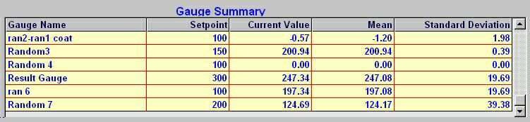
Our
software provides a list of Gauge names with their respective Set
point, Actual measured value, Arithmetic
Mean and Standard
deviation. The list of Gauges displayed in the window is defined in
the Selected Recipe's User
view.
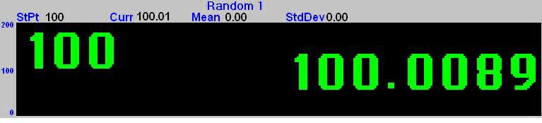
Software
will display a list of Gauges that are defined in the Recipe's user view. Out of this list only one gauge reading can be seen at a time. The
selected Gauge's Set point and process value is displayed in very large numbers
in the selected window. The current process value is displayed in colors green,
yellow or red
depending on the Gauges current Alarm
or Warning status. A Red
number indicates an alarm limit violation, a
Yellow number indicates a warning
limit violation, and a Green
number is displayed when no limits are exceeded.
Above the BIG Numbers is the Gauge name, Set
point (StPt), Current measured value
(Curr),
Mean and Standard deviation. and if
the Gauge is Tared then the Correction value will be displayed in RED.
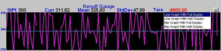
On the right
hand side above each window a button with an inverted triangle  is displayed.
Selecting this option displays a pull down menu with the following options. is displayed.
Selecting this option displays a pull down menu with the following options.
-
Line
Graph with full Display.
-
Line
Graph with half Display.
-
Bar
Graph with full Display.
-
Bar
Graph with half Display.
In case of full
Display, the graph occupies the entire window.
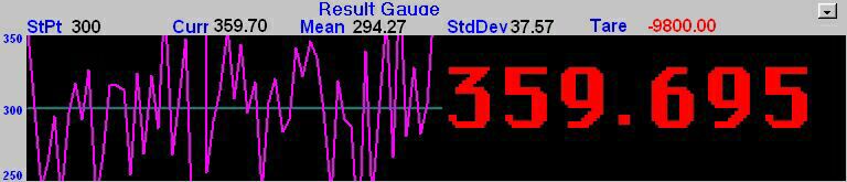
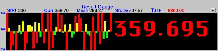
In case of half display
the window is divided into two sections. The graph is displayed on the left and
an enlarged actual current value is displayed on the right of the window.
The actual reading and each bar is color coded green,
yellow or red
to indicate the measurements Normal, Alarm or Warning status ( For Bar Graphs
only. The line graph is displayed in
magenta color and there is no indication on the graph of any sort of alarm or
warning violations ).
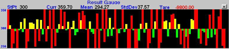
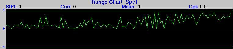
The Trend graph
is a bar graph showing the last sixty readings (in case of half Display) or last
120 readings (in case of full display) of the selected Gauge. In case of half
Display an enlarged actual current value on the right of the graph box is
displayed. The actual reading and each bar is color coded green,
yellow or red
to indicate the measurements Alarm or Warning status. Above the graph is the
Gauge name, set point, current measured value, mean and standard deviation. The
vertical scale of the Trend graph is set by the Gauges Graph
Range parameter such that minimum value would be the set point minus the
graph range and the maximum value would be the set point plus the graph range.
|
Line
Graph with full Display
|
|
Line
Graph with Half Display |
|
Bar Graph with full
Display
|
|
Bar Graph with half
Display
|
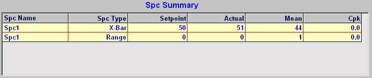
Selecting this option will
display a list of SPC Gauge name along with X-BAR set point, X-BAR actual, X-BAR
mean and process Cpk followed by SPC name, range set point, range actual and
range mean.
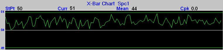
This display shows line graph
of the current X bar (mean of the subgroup) of the selected SPC Gauge.
This
display shows line graph of the current Range as per the subgroup size of the
selected SPC Gauge.
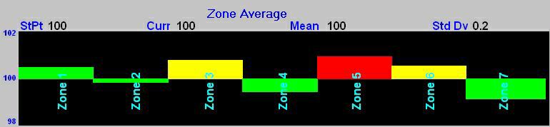
Profile graph will depend
on the Profile view selected in Recipe configuration. The display is divided
into sections depending on the number of Gauges selected in the view. The
reading of the last Gauge selected in the view is not displayed, but the set
point and the graph range of the last Gauge selected in the view are shown in
online display.
Note
: The last gauge selected for the profile view is an average gauge
preferably.
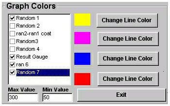
There
are 3 different types of Multi Trend graphs. On selecting this option a list of
all the Gauges for the current view is displayed. Use spacebar to
Select/Deselect a Gauge. Selecting 'Change Line Color’ option will display a
window with different colors. The user can move to a particular color box by
using arrow keys and press spacebar to select the color or mouse click on the desired
color box and mouse click on OK to
set the line color. A maximum of 4
Gauges can be selected.
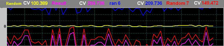
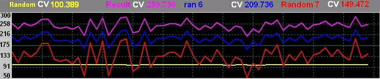
Displays multiple trend
plots by superimposing one on top of the other, like graphs drawn on the same
grid. An example of overlaid plots is shown in the following
illustration.
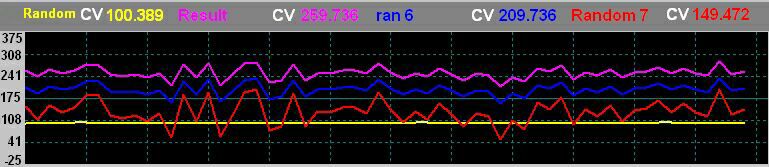
In case of Multi
Trend Type 2, the set point is the average of all the Selected gauges set
points. The vertical scale of the Trend graph is set such that minimum value
would be set by adding the average set point of the selected gauges to the
difference between the maximum and the minimum set point and the maximum value
would be set by adding the difference between the maximum set point and minimum
set point to the average set point.
In case of Multi
Trend Type 3, the user can set the graph range.
Any reading that goes beyond
the graph range is not displayed.
Note: Graphs
has a scrolling display. As each new Value is acquired, it is plotted at the
left margin, and old values shift to the right.
NTG
SAMPLE-->Production
Report for Adaptive
Technologies Limited
|